Iteration Management – Post #11 – Burndown charts
This post is a part of a series of posts about iteration management. If you want to start from the beginning, go here.
In my last post, I talked about metrics and how they can positively and negatively affect your project. In this post, I wanted to focus specifically on burndown charts.
Burndown charts are a commonly used way to show the progress of a project. Here is a really basic burndown:
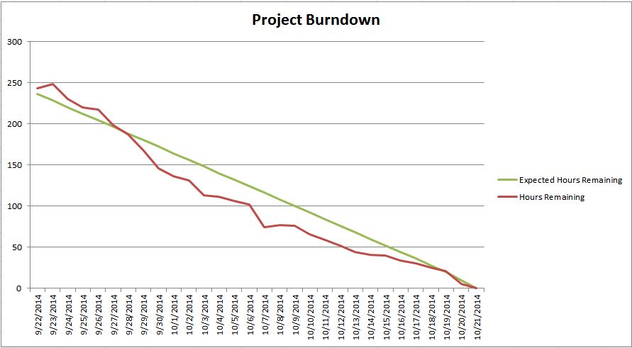
The green line shows the expected progress of the project. The line starts with the total amount of scope (measured in hours, points, # of tickets, etc.) and draws a line to the planned completion date. The red line shows the actual progress of the project over time. This is an easy and effective way to see if we’re ahead or behind and when we have large increases or decreases in the amount of scope, among other things. The x-axis of the chart can be measured in days, weeks, iterations, or however often you want to measure the progress.
People often show other data on burndowns as well. For example:
- Total scope
- Total work completed (“burn-up”)
- Work completed each iteration (velocity)
- Expected total scope (if you expect a significant amount of work to be added over time)
- Notes about significant events
Here are some burndowns that I’ve used over time.
Project level burndowns vs. iteration level burndowns
You can use burndowns to track the progress of a project over multiple iterations, but some people also use burndowns to track progress of work in a given iteration. In this post is going to focus primarily on project-level burndowns.
Learning experiences
Here are some burndowns that I’ve used in the past. I call these “learning experiences” because some worked better than others.
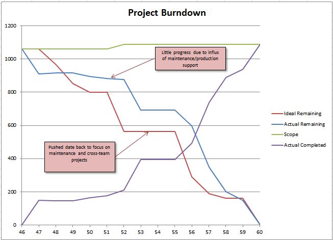
There are some interesting things going on here. First of all, the red line represents “Ideal Remaining Work” and instead of this being a straight line, it’s quite jagged. On this project (and many projects), the number of people focusing on the project was going to change over time. For a couple iterations, it was going to be one business analyst working on the project. Eventually we added in a few devs and testers, then didn’t have much work for an iteration or two (waiting for other teams to do their part, but no work for us). Then in the last iteration we completed a bunch of work that had to be done at the last minute. A straight downward line would not have reflected this schedule, so I made the red line reflect what we were planning for.
There were also a few hiccups along the way that pulled our focus from the project and made us focus on other things. Since we adjusted our plan, I adjusted the burndown accordingly and added some notes to explain what happened. One of my main points in my last post about metrics was that you have to be careful about people misinterpreting raw data from burndown charts, which is where the callouts come in handy.
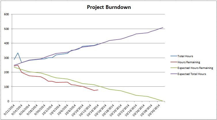
This is the burndown from the last post. On this project, we had some scope defined but we also knew that there was going to be a significant amount of more scope that we would uncover along the way. So I added an “Expected Total Hours” line that projected the scope increases over time (we based this line on the amount of scope increases from our previous project which was very similar to this one). The “Total Hours” line showed the total actual scope over time. As you can see, we were extremely accurate on the scope increases over time (because we tracked everything that we could and based our estimates on past data).
As I mentioned in that post, on this project the burndown was showing that we were ahead, but I knew that things had gone smoother than expected and as soon as we hit one bump in the road we would be behind. When you look at this chart, it’s really tempting to see a trend in the “Hours Remaining” line and visualize that heading down towards an early completion date. I felt that this was optimistic, but that’s the message that the burndown was sending.
In reality, this was more accurate:
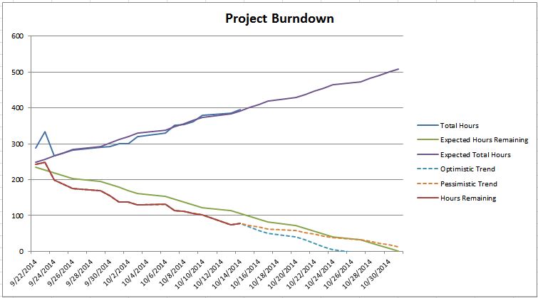
Here I added two more lines that showed that you would end up at different result depending on whether things were to go well or go poorly. The closer you get to the release date, the more certain you become of the result, but when you’re farther away, lots can change. This more accurately reflects that there was good chance of finishing on time, but there was still a risk of not making it.
Lo and behold, this happened the next day.
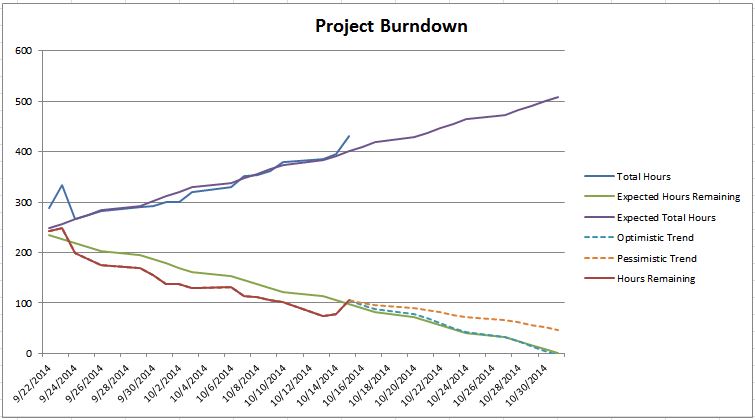
BOOM! The bump in the road that I expected happened. Suddenly things weren’t so rosy. In fact it didn’t look good at all. Thanks to my burndown chart, I (and everyone else that cared) immediately knew about it. Now look at my chances of finishing on time — not so good.
The learning experience here is that if I had had the dotted lines earlier showing the potential range of finishing points, I probably would’ve been able to show earlier that the project was at risk.
(Side note: this post is from awhile ago but it illustrates the same concept with some other cool ideas.)
Should you post a burndown chart?
I’ve had a lot of learning experiences with burndown charts, but the main takeaway is that you have to be careful posting charts and data that leave the interpretation up to the person who is looking at it. In my opinion, if someone misinterprets a burndown chart, that’s a lot worse than them not being able to see the burndown at all, because now they think they know the status of the project when what they think they know isn’t the truth. Not only that, you won’t necessarily know that they made an incorrect interpretation.
Because of this, I would be careful about sharing a burndown chart with others. I’m all for sharing information about a project with others, especially management. But I want to know exactly what it is that they want to know and then figure out the best way to communicate to them. Maybe that’s with a burndown chart (potentially with lots of callouts and accompanying explanations). But it might also be an email or a meeting where I use red/yellow/green indicators to indicate whether I think we’re on track, or maybe I just have a conversation.
I think creating a burndown and collecting all of the data needed to create it are invaluable, but that doesn’t mean that you need to publicize that information. You should certainly use the information to help with your own planning.
Read the next post in this series, Capacity planning.